Well, blogging, sure. I was back blogging yesterday. But mentally, no. I was still bitter (albeit recovering slowly), not to mention, so depressed I wanted to cave in and play video games of some sort yesterday. (I didn't. Came REAL close, but ultimately did something more productive. But more on that in a bit.)
Today...no fake smiles. I've been genuinely smiling for hours. I feel happy. Energetic. Now granted...first thing I do when I get home will still be taking a nap. No matter how enthusiastic I've gotten, my job still leaves me needing extra sleep every day. But...I'm actually feeling GOOD today, and that is a feeling which is unmistakable.
It's not just the feelings, either! Passion, too. Those are separate things. Feelings are for my emotions, passion is for my fundamental drive. Both have been dead-or-worse lately, and now I've got both back, in part for what I actually did do last night. So...you remember how I felt like gaming, right? (It's literally the blog post right before this, so, uh, yeah, you probably would. But just in case.)
Well...Chrono Trigger wasn't something I was in the mood for at the time. And...my options for gaming really aren't as vast as you'd think. (My PS2 requires memory cards which I'm not sure are there, would require me hooking it up to my TV via hunting down the appropriate cords, and then there's the whole matter of nowhere to plug it in for power. My 360 is currently plugged in, but has the same powering issues as the PS2 would have. I have a gameboy advanced SP, but I wasn't feeling any particular game, be it gameboy or GBA. So basically, games on the computer are generally my only realistic option.)
Only problem is...not enough time for a long game (I hadn't done my internet rounds for the night and it was like 8 PM at the time: given that it takes me ~3 hours to do my internet rounds, that meant at absolute most, four hours available), but too much time for a short game. Then there's the whole matter of where I would play the game. My computer, as in the laptop, does not handle internet games very well. My desktop was unavailable because my mom was on it.
So...no internet games. And even if I could, they'd run into the above problem of too short or too long, none at that "just right" level. At least, none that I haven't already played and/or beaten. (Plus, me being the type for 100% completion, even short games can suddenly become a marathon to reach that number.)
There's always the option of downloading a game through totally-legal-and-legitimate-sources and playing it on a totally-okay-and-not-at-all-violating-copyright-laws emulator (you know, kind-of like how I play Chrono Trigger in the first place), but the options there are also limited by the metric, mostly of the "too long" type. Or too hard, in the case of, say, Cave Story. (I forget if it was this laptop or my other laptop which I was playing it on, but I made it to the special bonus level of hell--pretty accurate given all the magma--thanks to a walkthrough telling me how to get the perfect ending, but because that level is ridiculously hard to complete on one gothrough and there's no save points at least until after the boss, I could never beat it: I could only GET to the boss in like 1/3 runs, and whenever I reached the boss I was at like one or two health, so I had trouble memorizing the boss's attack patterns, meaning I'd die early-on in the boss fight every time because, again, no save point, no health refill, having to navigate a gauntlet of fire every time just to maybe reach the boss.)
Like...I know on my old computer, I downloaded and played the original Final Fantasy, but that game is actually kinda both. It's ridiculously easy to find yourself underleveled unless you do a TON of level grinding, which is tedious and takes a ton of time, and the plot advances pretty slowly. Maybe that's because I just suck at combat, but it's a surprisingly challenging game. (Technically that download also had copies of the first seven games, too. I was surprised it had seven, so I checked that out, and it's not the original seven; it's a spriteified version of it. Don't know about 2, 3, 4, 5, or 6, but presumably they're like the originals given that the originals were still 2D. Never played them, though, because I wanted to beat the original first and never got strong enough to do so.)
So anyway, the point is...I didn't really have many gaming options available. So instead...I did art. See, I'm going to be using FireAlpaca for Red Hood Rider. It's a program I've heard nothing but praise for, and more than that, I've seen some killer comics that use it. It's also apparently very tablet-friendly (though I, uh...kinda sorta...lost my tablet's stylus pen, so...can't use it at all right now?), and generally a good art program.
It does seem decent, albeit not perfect, having some neat stuff in it. It's just that...I'm utterly inexperienced in using it. Jumping straight into making Red Hood Rider via comic pages with no experience in the program seemed like a very bad idea. So I decided I'd do something to gain experience. Which is what I set out to do: practice using the program.
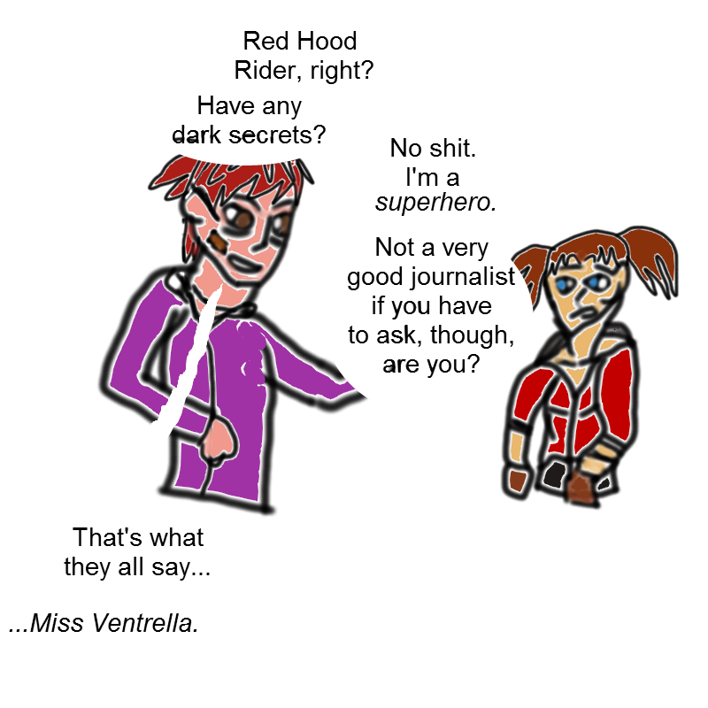
So...I practiced! Previously, I had made an absolutely-botched attempt. Look at this, and I think you can see why I considered the drawing a miserable failure. (This one was made with the tablet, mind you, for the most part.)
Still, while this image was an utter failure (if you can't tell, it's crossover fanart), it was a great learning experience. I learned that text in FireAlpaca is really, really large (the above was size three font), and while it can be easily edited/moved around, it cannot have in the same text a change in bold/italics/underline. By which, I mean, to make the italics, I needed a separate text box. I also noted that each text box, similar to GIMP, automatically has its own layer. (I'll figure out how to group layers in a folder I think next time.)
I also discovered that, while I did botch the art, and the speech bubbles were terribly done (using the lasso tool to paint them), I loved the no-black-outline approach and would include it in the remake. (For my actual comic, though, I think I'll still be using the black outline, simply because it is common in both western comics and in eastern manga. A lack of lines implies some sort of other aspect to the speech bubble, like distance--the speaker not being shown--or telepathy or an inner monologue or such.)
I also re-discovered the limitations of the airbrush tool: not so great for making lineart (because the lineart will have the white aliased line in there as shown prominently above), and how just blindly painting with the paint bucket tool will produce an ugly monotone color. (Flats are...flat.)
Plus, I was winging it anatomically and positionally, which shows. Time for round two!
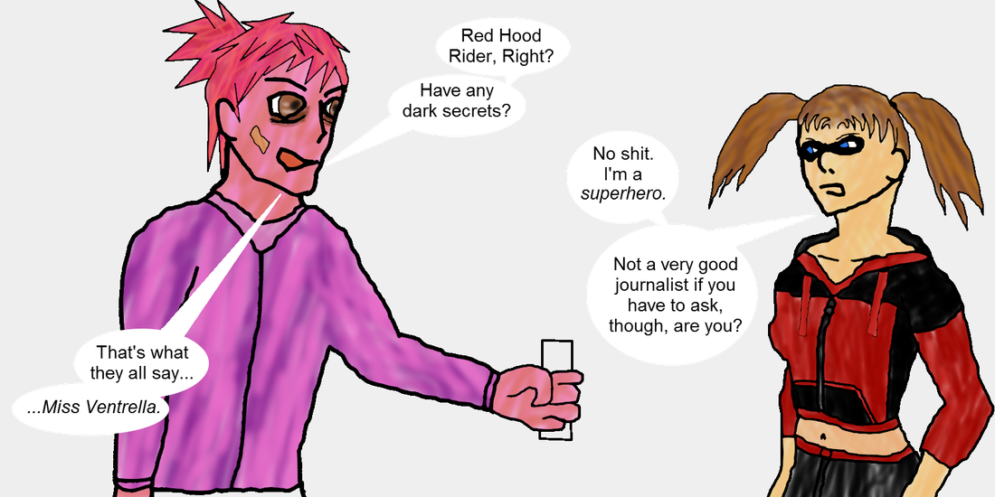
Using just the mouse, I was still able to produce something yesterday (in about three hours or so) that has reinvigorated my passion, my flame, for Red Hood Rider. Just see for yourself as for why!
The lineart's not great on him, and I forgot his signature pencil above the ear. (The choice to leave out his camera, though, was a deliberate choice.) Then, you get to Ruby. I'm not 100% satisfied with her pigtails, I don't think I nailed her hairstyle, I think her neck is too long, the coloring for her hair definitely is off, her domino mask is too small, and there are many, many, MANY details missing from her outfit (didn't get the zipper on her pockets, didn't get the seems on her arms, didn't draw her two hairties, didn't draw Angel Wings in his sealed bracelet form, and didn't draw her gloves), not to mention, the lineart for her is WAY more shaky for Drake and I don't feel her clothing is quite as organic as it should be (too tight for the arms, not tight enough for the chest area given a lack of shown breast outline, and again too tight for the bottom of her hoodie).
...Plus, as it turns out, the paint tool by default has antialiasing on, a very much not wanted feature which you can see via the speech bubbles by looking at them close enough. (There's small gaps, caused by the paint tool.) That doesn't even begin to go into how the airbrushed colors are a little bit too transparent. (Exercise: copy this image and paste the image url into different browsers which each have different backgrounds. Black for Firefox I think, white for chrome I think, and so on and so forth. Observe how, on each background, the colors change to match the background color, becoming blacker on black and whiter on white. That's because of the nature of the airbrush tool in relationship to opacity.)
...All the same...
...In spite of those flaws?
...I love. Love. Love. This image. It's ridiculously promising. I love the technique I used. (I made a black background and set its opacity to like 12%, which is why the above background is not pure white, allowing for the text to stick out more.) I like how each color I used on Ruby came out. Her hoodie's colors are perfect, and her skin color's great, and her eye color is excellent. (Not to mention, a great expression on her face, too.)
I did cheat a little bit: I used QAVimator images for both Ruby and Drake, positioning the models, then scaling up the images of them to fill the canvas up, and basically traced them to get the anatomy right, but this is basically no different from what I'll be doing on my actual pages, where I'll be tracing my own artwork. (For the most part, aside from small corrections.)
Most of the flaws, though, I think can be fixed with simple practice. For instance, that transparency issue? A quick easy fix would be introducing the concept of 'lighting'. (I've only done this once before, on a NSFW image of a friend to a female werewolf: I used yellowish 'sunlight' and had it fill their silhouette a layer or two below the artwork. With me using airbrushes--or was it just not having the color layer fully opaque, I don't remember which--the result was that some yellow popped in without the background in there.) Said lighting would be a simple, 30-second fix, once I have established the lineart layer as being finished: just use the magic wand tool, get everything inside the lineart selected, and color it the color of the light source. (Yellowish for sun, blueish for most indoor lighting, etc.)
...That might not get the right exact color I'm hoping for, though, so I've got a second step in mind: flats. As in, a layer above the lighting, explicitly set to a lower opacity level as to allow the light through (it's a weird concept to think of light as the lower layer and lineart as the highest layer, but it actually works), and have flat colors that will represent the actual colors of the image.
Then from there, just airbrush away. Using the same technique I did above (basically, every spot has three different colors, except the black: adjusted with coloring slightly, saturation slightly, and luminescence slightly to produce three similar colors with one as a middle, two others being slightly different base colors with higher or lower saturation and being either darker or lighter), the results should be similar, except...even better.
I think...I think I can actually make this work!


 RSS Feed
